Overview
A beloved physical product — with serious limitations
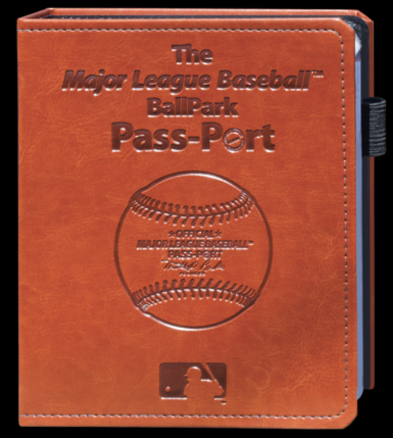
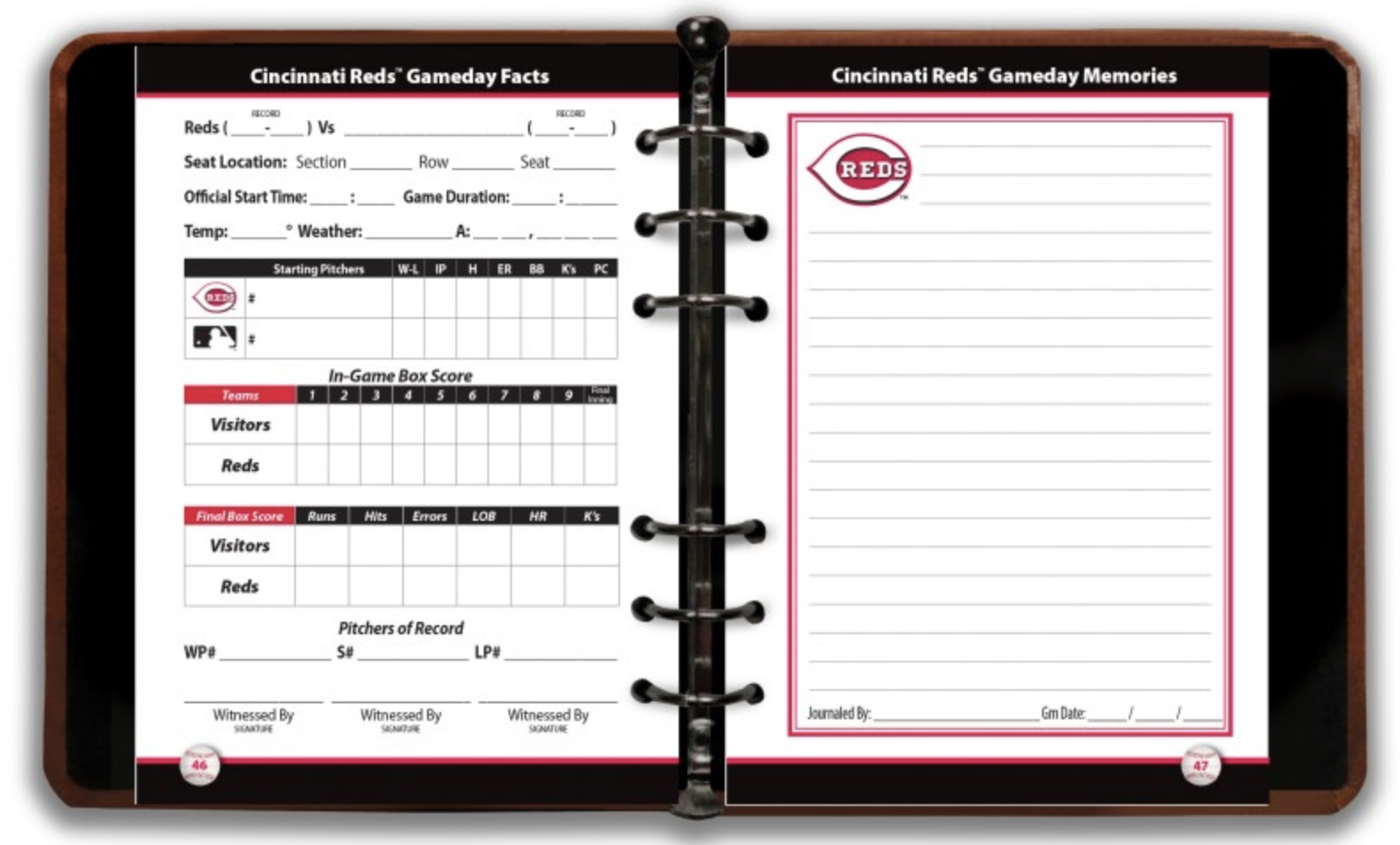
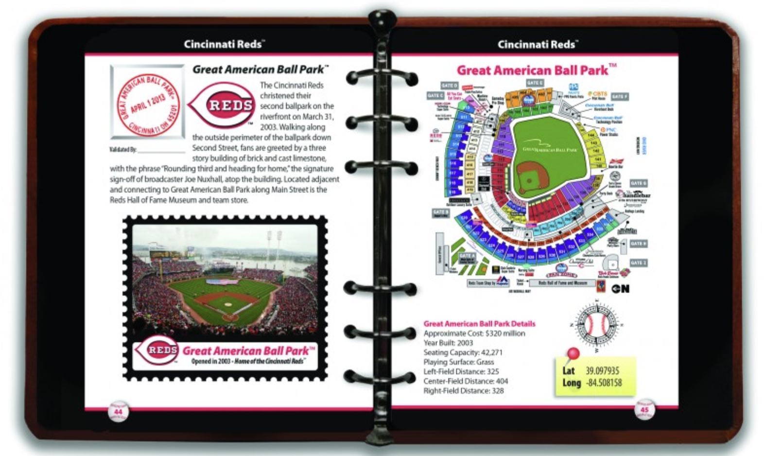
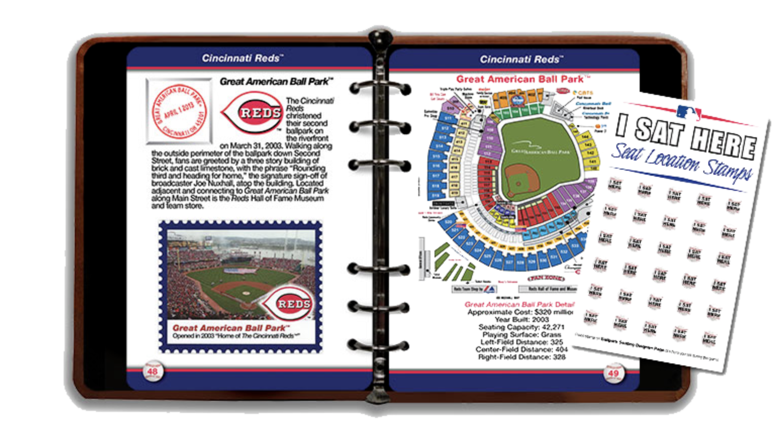
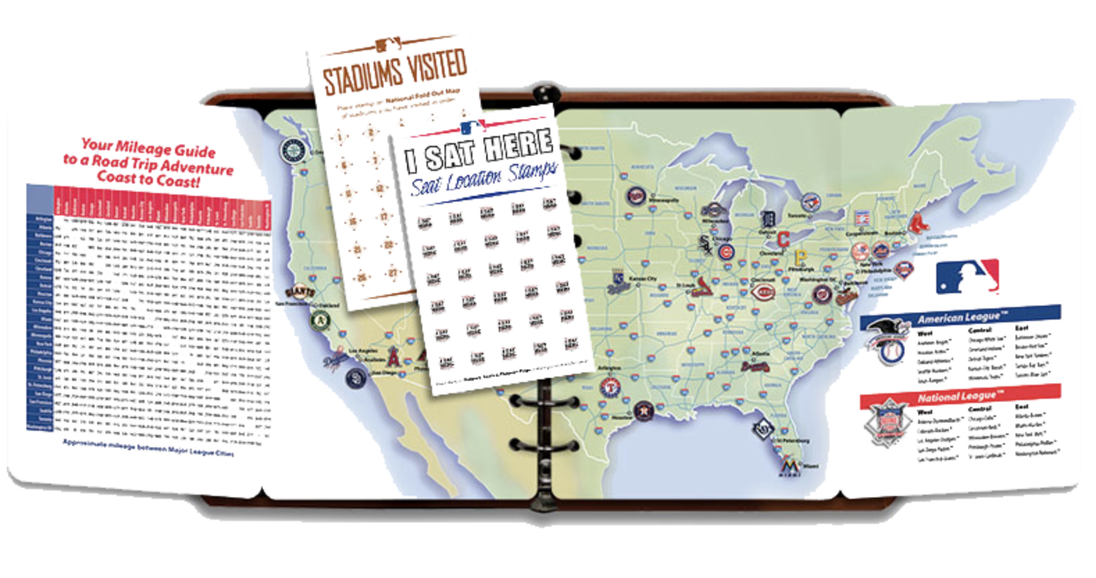
The MLB BallPark PassPort is a physical book where baseball fans collect rubber stamps at each of the 30 MLB stadiums. It's a beloved tradition — but the product is frozen in time. It can be lost or damaged, offers no real-time data, has zero interactivity, and gives fans no way to track their progress or share their journey.
DiamondPassport solves this by taking the spirit of the physical passport and rebuilding it as a native iOS app — one that's smarter, more social, and genuinely fun to use.
GPS geofencing
Verifies you're physically at the stadium before letting you check in — no remote check-ins, no cheating the journey.
Live MLB Stats API
Auto-fills game day data — score, lineups, weather, first pitch — so your visit record is rich without any manual entry.
Scavenger-hunt stamps
Each stadium has an iconic landmark to find and photograph. The Green Monster at Fenway. McCovey Cove at Oracle Park. Finding it unlocks your stamp.
XP & tier system
A Duolingo-inspired progression system keeps fans motivated across what might be a multi-year journey to all 30 parks.
Research
Starting with the physical product
Research began with a deep dive into the existing MLB BallPark PassPort — analyzing how stamps work, what data fans track, and what the physical book includes. The goal was to understand what made the physical version beloved, and where it fundamentally failed modern users.
The physical passport can be lost, offers no real-time data, has no social connectivity, and can't be updated. It's a beautiful artifact — but a terrible product.
Competitive analysis expanded to include indirect competitors: the official MLB Ballpark app (check-in model but no gamification), Untappd (check-in and badge model for breweries), and Duolingo (XP and streak system for motivation). Each informed a different dimension of DiamondPassport's feature set.
Stadium research covered all 30 MLB parks to identify the single most iconic landmark at each — the visual hook that would define each stadium's stamp challenge.
Target Users
Three types of baseball fans
Three distinct user archetypes emerged from research — each with different motivations, but a shared need for something better than a rubber stamp in a physical book.
Primary
The Completionist
"I've been to 19 parks. I'll get to all 30 if it takes me a decade."
- Age 25–40, travels specifically for baseball
- Wants detailed visit records
- Motivated by milestones and progress
- Plans trips around stadium visits
Secondary
The Casual Fan
"I go to 6–7 games a year. I'd love a better way to remember them."
- Attends mostly local games
- Wants to capture game day memories
- Motivated by gamification and photos
- Casual but consistent engagement
Tertiary
The Family Fan
"My kids love going to games. I want to make it an adventure."
- Parents with kids at stadium visits
- Wants interactive, engaging activities
- Motivated by scavenger hunt features
- Values shared family experiences
User Flows
Four core journeys
Four primary flows govern the app experience — from arriving at a stadium to earning a badge. Each flow was mapped before any code was written to ensure the logic was airtight.
Design Process
A new kind of workflow — human direction, AI execution
DiamondPassport was built using a human-AI collaboration model that compressed what would typically be months of solo work into three weeks. Every creative and product decision was mine — the AI executed my vision, challenged my thinking, and handled implementation.
Concept & Strategy
From one idea to a full product brief
The project started as a single idea: digitize the MLB passport. Through a structured brainstorming session with Claude AI, it expanded into a full product — GPS verification, live data integration, gamification, AR stamps, AI memory cards, photo challenges. The AI produced a 20-page technical architecture document that became the project's north star.
First Build
Functional but soulless
Claude Code built the initial implementation quickly — but the result was visually sterile. Default SwiftUI components, identical icons for all 30 teams, generic white backgrounds, system fonts. It worked. It had no soul.
Design Audit
Diagnosing what felt wrong
I brought screenshots of every screen back to Claude AI for a collaborative design audit — screen by screen. Same red diamond for all 30 teams. No team color theming. Fitness-tracker progress ring. No photography. Boring typography. The diagnosis was clear: it looked like a settings app, not a baseball adventure.
Design Direction
Finding the right references
I identified three design references: Duolingo for gamification energy, Instagram for visual-first photo moments, Airbnb for exploration feel. Each mapped to a specific part of the app. The result: a dark charcoal theme with bright team colors, SF Pro Rounded for playful energy, and MLB Red as a consistent accent.
Visual Overhaul
Screen by screen, spec by spec
Armed with a screen-by-screen design spec, I directed Claude Code through the rebuild. Team-colored identity circles replaced generic icons. Warm dark backgrounds replaced clinical white. The most impactful change: map pins that transform from gray/locked to team-colored on visit — turning the map into a record of everywhere you've been.
Final Product
The app
Nine screens cover the full experience — from browsing stadiums and checking in, to tracking progress by league, collecting landmark stamps, and logging your journey over time.


