Overview
A growing brand held back by its own website
SoleSeattle has grown significantly over the past five years — but their website hasn't kept up. Outdated visuals, blurry product imagery, and usability friction create a disconnect between the brand's real-world success and its digital presence.
This project set out to close that gap: redesigning the SoleSeattle website from the ground up to modernize the interface, improve usability, and create a shopping experience that actually reflects the quality of the brand.
↑ The original SoleSeattle website before any changes
Research
Understanding users before designing for them
I conducted in-person and video interviews with 5 participants aged 16–26 to understand how real users browse and buy from sneaker e-commerce sites. Rather than asking hypothetical questions, I had each participant walk me through their actual shopping behavior on their favorite site — then show me their reaction to SoleSeattle.
"The blurry images give off a bad first impression. I wouldn't trust buying from here." — Interview participant
How users browse
Two clear patterns emerged: users either filter down by category (brand → size → condition) or go directly to a wishlist or saved items to check availability and pricing.
What builds trust
High-quality product photography, detailed descriptions, sizing info, and visible reviews were the most cited factors in deciding whether to complete a purchase.
What frustrated them on SoleSeattle
Blurry images, a cluttered hero section, inconsistent layouts, missing product photos, and outdated pagination were the most common complaints.
What they loved elsewhere
Watchlists, product recommendations, transparent shipping costs, and clean layouts that didn't require reading long blocks of text to find what they needed.
User Personas
Who am I designing for?
Research surfaced two distinct user types — a passionate collector who shops online out of necessity, and a dad buying a gift with no familiarity with sneaker culture. Both need clarity, trust signals, and an easy path to purchase — but for very different reasons.


Design Process
Lo-fi to hi-fi — building up in layers
Lo-Fi Wireframes
Lo-fi sketches focused on homepage clarity and establishing the right structure for product discovery. The goal was to get layout ideas on paper fast — without getting distracted by visual details.


Mid-Fi Wireframes
Mid-fi moved into digital, refining layouts and interactions while preserving the familiar patterns SoleSeattle users already know. The focus shifted to fixing specific pain points — stronger CTAs, better filter placement, and improved visual hierarchy. Midway through this phase, I felt the homepage still lacked real improvement, which pushed me back into ideation for a better direction.


Hi-Fi Prototype
The high-fidelity prototype applied final visual design, typography, and spacing across the full purchase flow — homepage through order confirmation. The goal was a modern, trustworthy shopping experience that felt native to sneaker culture without alienating existing users.
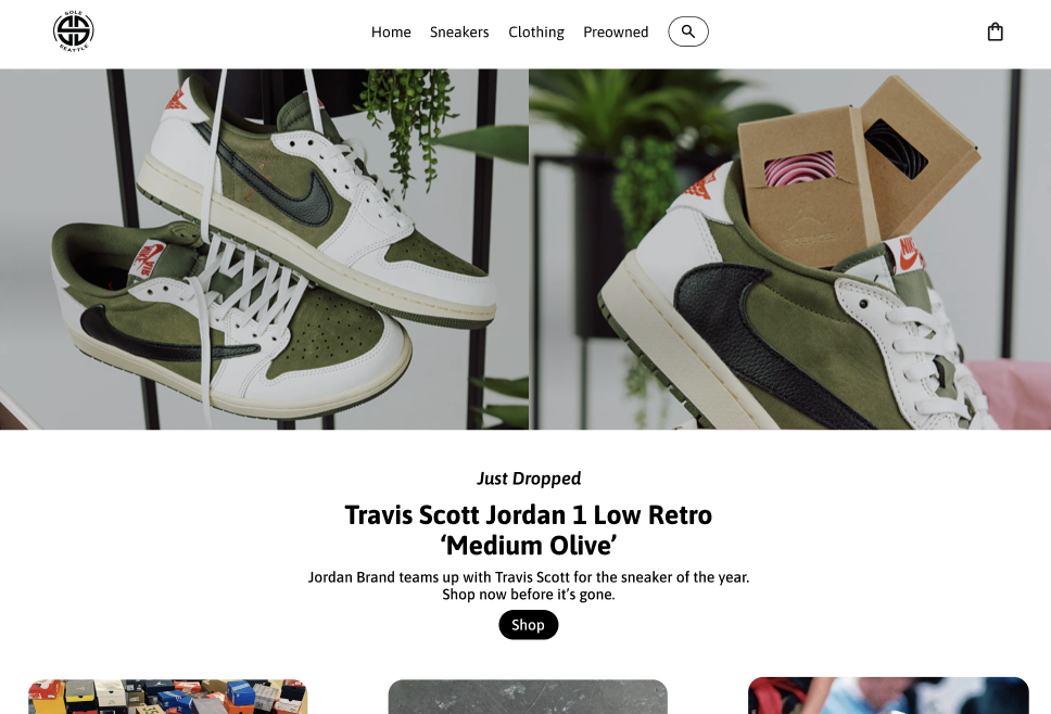


↑ Final prototype walkthrough — homepage through checkout
User Testing
Validating the design with real users
I ran usability tests comparing the redesigned prototype directly against the original SoleSeattle site. Two tasks were tested: a search-based flow and a filter-based navigation flow — both ending at order confirmation.
Task completion
Participants completed both tasks faster and with fewer errors on the redesigned prototype compared to the original site.
Filtering
The new filtering system felt intuitive and efficient. Users noted clear visual feedback when filters were applied and found it easy to adjust without losing their place.
Visual trust
Improved product imagery significantly increased user confidence. Multiple participants said the redesign felt "more premium" and "more trustworthy" than the original.
Overall feedback
Users described the redesigned experience as cleaner, more modern, and easier to navigate — with reduced friction at every step of the purchase flow.
Outcome
A modern experience that respects the brand
The redesign successfully addressed every major pain point identified in research — blurry imagery, poor filtering, cluttered layouts, and low visual trust. The updated prototype delivers a cohesive, user-friendly experience that feels modern without alienating SoleSeattle's existing customer base.
The result is a scalable solution ready for handoff: improved product findability, reduced cognitive load during browsing, and a shopping flow that actually reflects the quality of the sneakers being sold.
Key win: Users moved from landing page to order confirmation with significantly fewer steps and zero confusion about where to go next.